|
Improving by reducing contrast
There's still one thing we can improve: reducing contrast a bit by adding some fill-in light to the dark side of the walkman. If you look at the right side of the walkman on previous photo, you can hardly see buttons over there. You know they are there, but it's almost impossible identificate them.
That's because contrast is still high, but we can easily fix that. All you need is a white carpet. If you place one big carpet near to this dark side so it receives direct light and reflects to that side, you can greatly improve the results. Look how I did in this example:
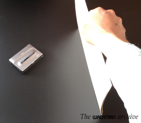
Now let's see how it looks like with and without carpet:
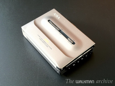
| Without carpet |
With carpet |
 |
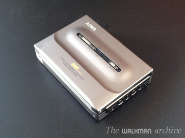 |
Notice the difference? In the right shot you can easily see the buttons: you can count them and see how they are. In the left shot, you can only imagine that there are buttons there.
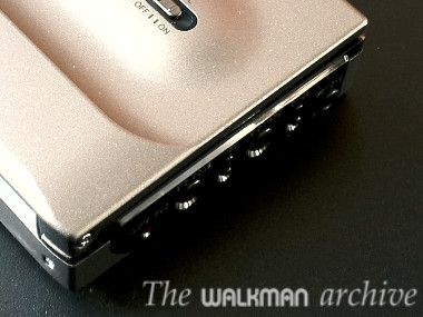
| Without carpet |
With carpet |
 |
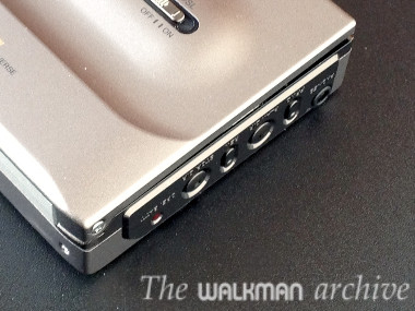 |
Let's see another example. If light comes from upside and you add some fill-in light at the bottom, the resulting shot is very nice too:
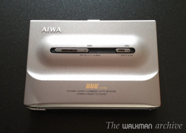
Notice the fill-in light at downside? Yes, that's because of the carpet, that always has to be placed at the opposite side of the light font.
Let's see one more example: you can use the carpet and place it just over the walkman, causing a very nice lighting too:
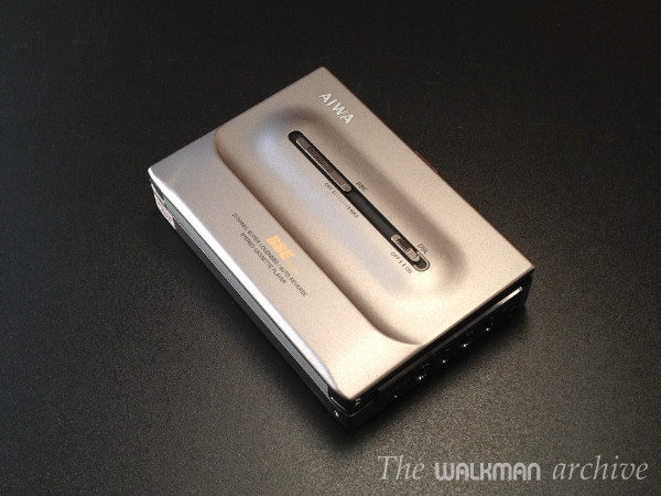
Wow! Incredible that this shot is made with a phone in one hand and a carpet in the other. No studio lights... no other tricks.
However, be careful, as this normally higher the contrast and it is high in all session if you are using black background.
Hope this helps you take better photos of your gadgets.
|
![]()
![]()
![]()
